Dashboard: Definition, Types, and Guide
11 minutes
37
Data plays a vital role in efficient marketing for every business today. However, when we take a look at the raw figures, they can be overwhelming and misleading. So, to understand data better and extrapolate the most important information, we visualize it in dashboards for better understanding and analysis.
Here we will discuss what a data dashboard is, how it works, the different types, and the right way to create your own data dashboard for detailed reports.
What Is a Dashboard?
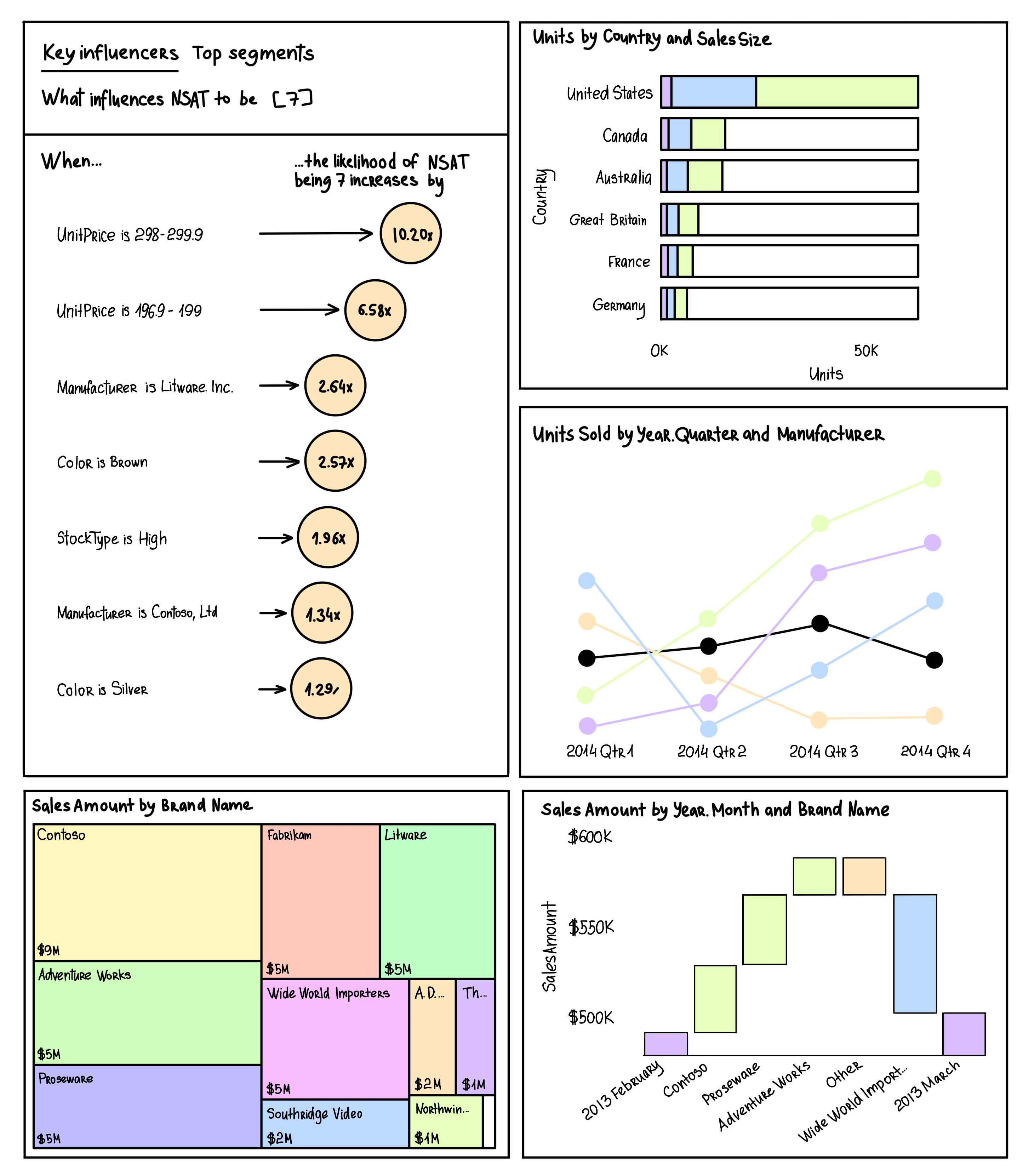
A data dashboard provides ways to display different types of data for easy understanding. Instead of providing raw numbers and statistics, it is a visual representation of data displayed with important business metrics, including KPIs. Thus, all technical and non-technical business stakeholders can understand the insights of the data displayed.
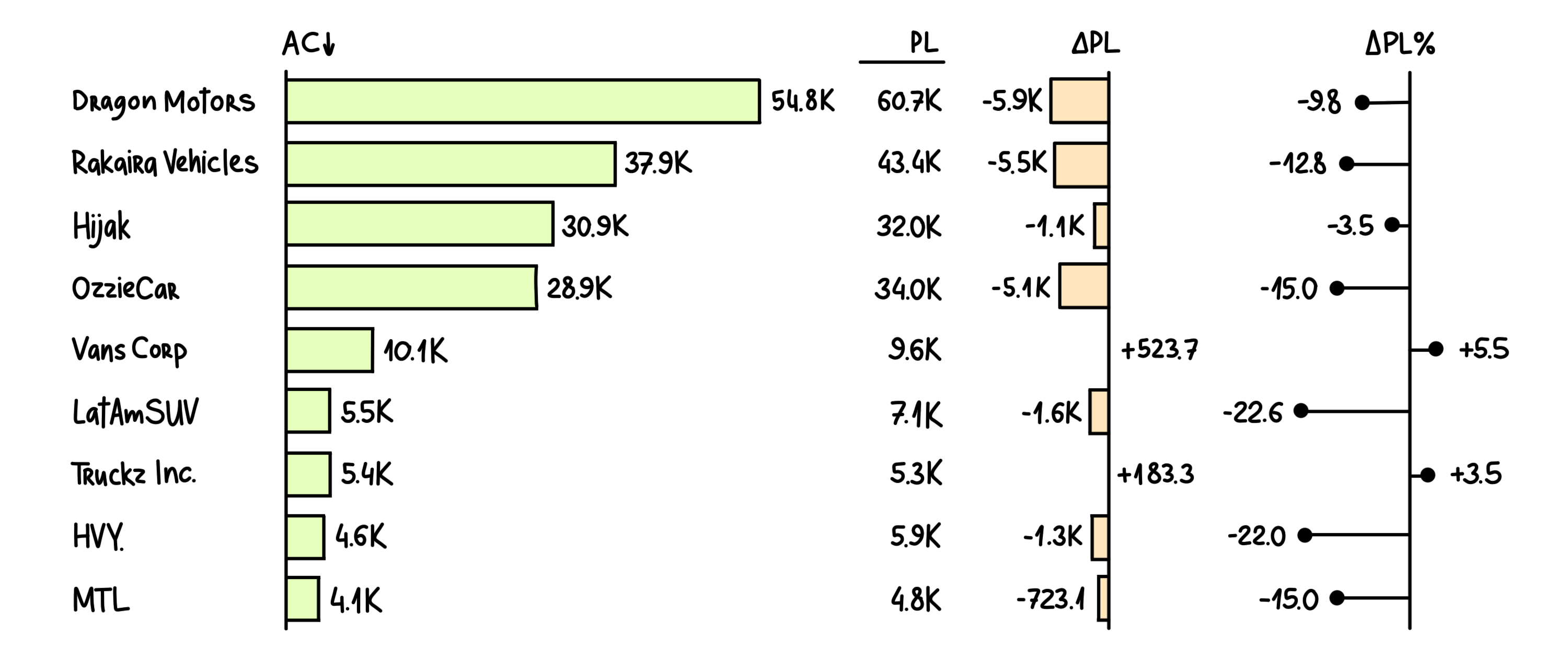
Dashboards come with high customizability and allow you to use all data types and ranges for an easier understanding of complex information. You may use different methods of representation, including:
- Tables
- Graphs
- Charts, etc.
For example, Looker Studio allows you to turn any data into a customizable dashboard within a few clicks. You can connect data sets, databases, files, social media platforms, or Google Marketing platforms. Its visual editing interface helps create dashboards with drag-and-drop functionality where you can also generate dynamic reports.
Why Are Data Dashboards Important?
A dashboard makes an important part of a marketing and business strategy as it helps stakeholders analyze data for decision-making. Dashboards with real-time interactive data dynamically help you make precise decisions. Using business dashboards can bring several benefits, including:
- More clarity
- Real-time analytics
- Accurate forecasting
- Greater transparency
- Intuitive statistical presentations
- Higher accessibility.
Tableau is a great choice for understanding data through business dashboards. It creates interactive visualizations with real-time data instantly. It is designed to handle massive growth and a variety of data sources and scale according to different types of analytics.
What Are the Different Types of Dashboards?
There are four main types of dashboards, classified as:
1. Strategic Dashboards

A strategic dashboard measures long-term company strategies by focusing on key success factors. It is good for use with large businesses for measuring their strategic goals. As these work on the long-term goals, you get more functionalities to work on all the small details. When implemented correctly, it can reduce a business’s time to meet a KPI, resulting in lower operational costs.
A high-level sales dashboard tracking the number of customers, average recurring revenue, average contract value, and pipeline funnel is a good example of a strategic dashboard.
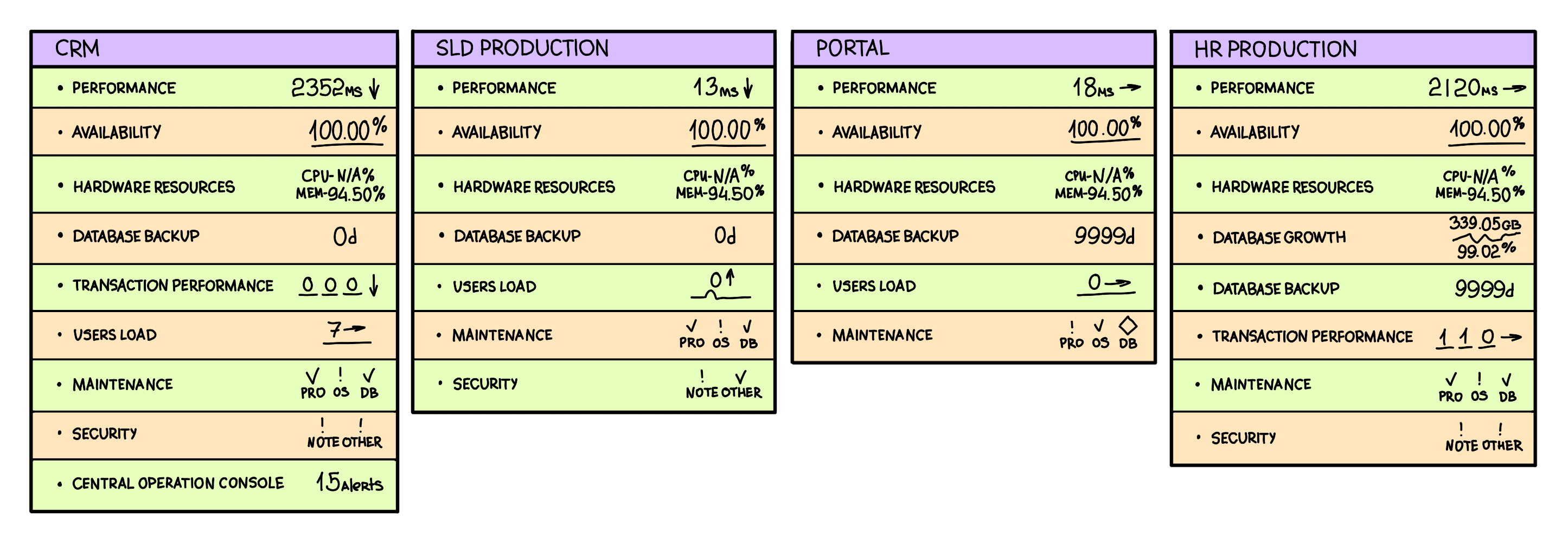
2. Operational Dashboards
The operational dashboard can monitor performance and business operations over a shorter period. The best instance for this dashboard will be providing day-to-day operational analytics at a glance. As it works for operations, this dashboard can be used by junior management to monitor company activities under different departments.
Mostly, it is based on real-time data, so the right approach can be chosen immediately if there is an unexpected event or a negative change. The best benefit of using an operational dashboard is that problems can be dealt with at their initial stages.
3. Analytical Dashboards
The analytical dashboard uses past data to identify trends to make data-backed decisions for a better future. Creating these dashboards requires using special analytics tools, which are easily accessible. These dashboards can provide detailed insights, which can help stakeholders make complex decisions based on customer churn, marketing spending, product features, and more.
A healthcare analytical dashboard is a perfect example of an analytical dashboard, as it helps deliver quality care to patients while reducing their waiting time. Hence, it improves profitability for hospitals.
4. Tactical Dashboards
Tactical dashboards are used in organizations where more in-depth business analysis is required. These dashboards can monitor, process, and present data for a quick look at any department’s performance. So, the managers can take action to maintain optimal performance within the department.
Tactical dashboards can trace real-time data and process it to provide insights that sit perfectly between operational and strategic reports. An HR management dashboard is a perfect example of a tactical dashboard.
Where Are Business Dashboards Used?
According to the dashboard definition, these take data from various sources and are visually present for easier interpretation regardless of the technical-understanding level of the viewer. So, exploring different aspects of run-time data is easier, which comes with some major benefits for future business decisions.
With all these benefits, dashboards are used by different users from various industries. The best example of a good dashboard can be the Google Analytics system, where you get information about your campaigns and the effectiveness of a specific process against previous data-driven decisions. Some examples of dashboard utilization in different fields include:
- Employee management to plan tasks and workload.
- Hospitals use dashboards for financial management and maintaining records
- Universities and institutions use dashboards for attendance, grading, and other use cases
- Personal usage for self-analysis and development.
Thus, it’s not only businesses that use dashboards; several other fields can benefit from them too.
Looker helps organizations gain useful insights from big data analytics. It is a complete hosting platform with installation, deployment, support, mobile app, and other BI tool features. Designing your organization’s dashboard with Looker is easy: you can select queries according to your needs and import data from various sources..
Useful Tips for Creating Your Dashboard
Here are the 11 key practices you may follow to create your dashboard:
1. Define the objective of your data dashboard against its audience
You will begin by defining the audience and objectives of your dashboard. There are six main questions you need to answer:
- Who are you helping with this dashboard?
- What are the daily tasks of your audience?
- What goals is your audience trying to achieve?
- Which KPIs may help your audience achieve their goals?
- What are the current views of your audience about your KPIs?
- How can storytelling be used to convert KPIs into visual content?
By answering these six questions, you will know the right audience and the objectives your dashboard needs to work on. Considering these, you can follow the next steps:
2. Your data must be clean and correct
The next step involves working with your data, as it will be the backbone of the dashboard. When it comes to data, you may get it from several departments and data sources, so identifying which one is efficient will be necessary. Keeping your data clean, consistent, accurate, compliant with the company procedures, and complete will help save time and resources. So, make sure that the data you choose has all these qualities.
3. See how different charts work and select the right one
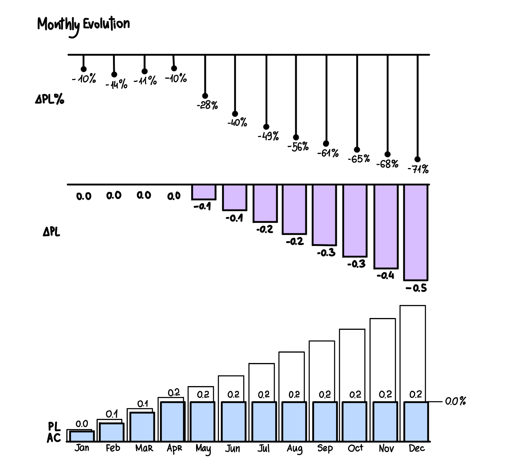
Dashboards are all about data visualizations, so finding the right way to present your data is important. When designing your dashboard, you may find several types of charts, including:
- Bar charts
- Line charts
- Pie charts
- Area charts
- Gauges
- Tables
With each visualization style showing the same data differently, using the right one according to the data type is essential. Otherwise, you may not present the information that well.
4. Your dashboard must be focused and to-the-point
The dashboard must be easy to understand, and the information provided must not be misleading. Here are a few practices to keep in mind when designing your dashboard:
- Include both positive and negative values
- Provide context with data to keep it informational
- Always start with a 0 value for a clear understanding
Misleading data visualizations can lead your organization toward wrong decision-making, so they must be avoided at all costs.
Metabase provides over 15 built-in visualizations that you can use to track performance continuously. By choosing the right visualization type here, your business dashboard’s overall functionality is enhanced according to the business goals.
5. Use colors to your benefit
Colors make up a huge part of the dashboard design as they help distinguish different parts of a chart for easy comprehension. However, the experience may not be the same for colorblind people. So, you must be careful while designing the dashboard.
By avoiding overlapping shades and colors, you can solve this problem. Selecting some standard colors and using them throughout the dashboard can help maintain total visibility for everyone.
6. Facilitate data comprehension by giving more context to values
Adding context to the insights can help in better decision-making. Without context, the data can be misleading, and that dashboard may not be that beneficial for decision-making. For instance, 100 sales today may seem good, but when you give the context of 150 sales daily in the past month, it makes clear that some improvement is required.
7. Focus on building a balanced perspective with your key performance indicators
Use your KPIs to tell the story creating a panoramic view of the dashboard. A balanced perspective includes critical data to clearly understand past trends and projections of expected future outcomes, along with real-time data analysis to track the current process. Creating this balance will improve decision-making as every choice will be made after considering each aspect of the data.
8. Simplify with predefined templates but don’t neglect customization
When designing a dashboard, many businesses waste time by working from scratch. It is something you don’t need to do, as there are several predefined templates already available. Simply select the right one, and the software will generate the dashboard. Next, customize it according to the way you want to visualize your data. With the right customizations, you will save time, while the dashboard will help you make more informed decisions.
Redash is a must-try platform if you don’t want to go with predefined templates. It allows designing everything from scratch with full control of customizations. You can combine several visual elements with drag-and-drop functionality. Thus, one dashboard can visualize several data sources with automatic real-time updates.
9. Mobile optimization is necessary
You don’t know when an end user will use their smartphone to access the dashboard and when they will open it on their PC. So, optimizing the dashboard for mobile devices is a good practice. This optimization will improve the user experience for every end-user.
However, on a smaller screen, you may need to reduce the amount of information displayed or its size. It will still be easier to visualize than getting information from an Excel spreadsheet.
Power BI from Microsoft helps generate reports optimized for your mobiles. It can turn raw data into scalable dashboards with interactive infographics. It allows compiling data from various sources, and every piece of data can have its dashboard for comparison, assessment, and sharing with others.
10. Interactivity can be beneficial
To make your dashboard advanced, you can consider creating an interactive dashboard where users can interact with all the information provided for much better control and understanding. Using the right template may not require you to put in additional effort. However, while using interactivity, ensure you don’t overcrowd the experience, as it can reduce the emphasis on important visuals.
11. Get feedback to improve your dashboard
Once you are done designing the dashboard, you must let the end users try it and leave unbiased feedback about their experience. You must improve their experience, and upscaling the dashboard features can help.
Whenever feedback highlights a productive change in your dashboard, you must go for it. It may take a few iterations, but ultimately, you will be left with a dashboard that meets all objectives and audience requirements.
Do’s and Don’ts When Creating a Dashboard
Here is everything you must consider when working with your dashboard software:
Do’s
- Build business dashboards by keeping the audience’s needs in mind
- Use data visualizations to tell a story, as it will be easier to comprehend
- Including KPIs is essential, as is maintaining a simple and clean outlook
- Every new dashboard must be better than how your audience viewed their KPIs previously.
Don’ts
- Never display too much data, as it increases complexity and decreases readability.
- Pie charts must be avoided until you are presenting parts of a whole.
- Don’t go with the same colors all over your performance dashboards, as it might get hard for colorblind people to see the difference
- Never go generic with your dashboard; always use customizations where possible.
By the end of this process, you must create a dashboard that can help end-users make decisions based on the data you present, depending on their context and their familiarity with the KPIs.
The Verdict
Today, most marketing strategies need you to make data-backed informed decisions. Getting the most out of your data may seem impossible until you use a proper visualization type and visual arrangement. With different types of data dashboards, you can get high customizability and versatility for data analysis. This allows you to empower your team with data-driven decisions while setting up new business goals based on better data clarity.

We convert raw data into meanigful insights for you to make the best decisions.
Featured Articles
-

Top 5 Data Visualization Tools in 2023
A simplified representation of complex data is key for any data-driven business. Raw data must be turned into a cohesively formatted visual that is…
Read more -

SnowFlake: The Best Data Warehousing and Prescriptive Analytics Solution
Data Warehouse as a Service, or DWaaS, has gained much popularity in the past decade. It is a service primarily provided by Snowflake Inc,…
Read more -

Simple Mobile Analytical Stack: Firebase + BigQuery
Developing reliable and high-quality mobile and web applications requires a lot of dedication and, more importantly, a powerful and feature-rich development platform. Firebase, provided…
Read more